
Hipages is a marketplace platform that connects customers to local tradespeople to complete jobs around the house. I was tasked with redesigning the credit usage screen so that tradespeople could easily track their credit spending.
My role:
Interaction design, Visual design, User flows, Rapid prototyping, User research and UI design.
Results:
Increased sales conversion rate for premium packages by 30%
Increased credit spending for customers on premium packages by 8%
Tradespeople receive a monthly credit allowance they can use each month to accept leads for jobs. However, the business decided to develop a new subscription package that would change how credit was spent. So I worked on a project that would oversee how our customers would experience this new product.
Lessons learned:
01
Less is more.
Working through designs and finally removing unnecessary numbers helped make credit tracking easier. I became more intentional with what to show on the screen as I progressed through the project landing in a nice spot.
02
Learning to love solving complex edge cases.
This was the project that opened my eyes not to overlook edge cases and map out different scenarios. Having a design that scaled and that was flexible to any scenario was challenging but rewarding in the end. This helped me prepare for future projects in my career.
The problem
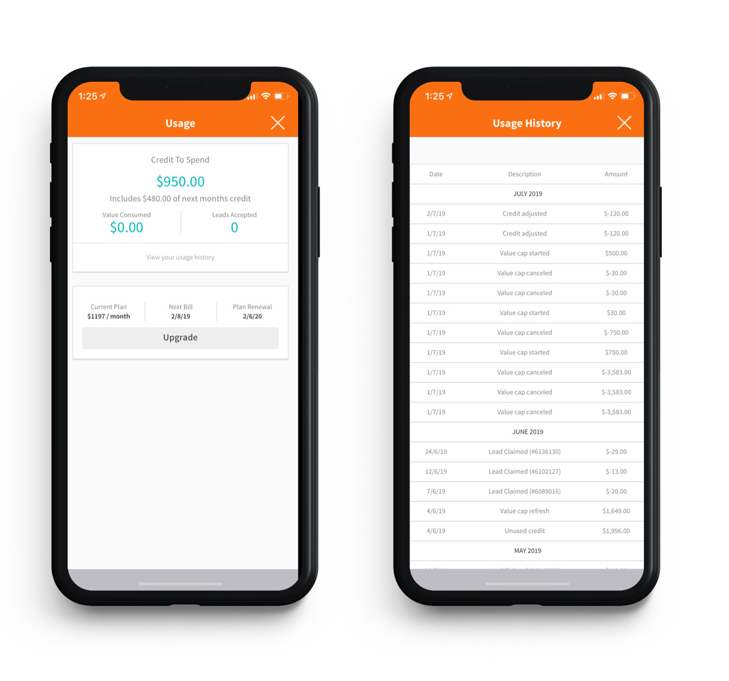
Tradespeople today have to navigate an outdated usage tracking screen that needs to be more transparent to the user. For example, it doesn't have a running total of the credit they are spending per lead transaction, nor does it communicate when a credit lead is about to expire.
The credit statements were also broken down by the months of the year rather than by the tradesperson's billing cycles. This made it hard for our support team to narrow down what lead the tradesperson referenced when they called up with a problem.
My hypothesis was if we had clearer transparency on when credit was going to expire it would lead to more tradespeople spending credit and claiming leads. This would have a knock-on effect on our sales teams as more accurate spending data on customers would help them know when to offer upgraded plans.
Research
Reviewing our current usage screen uncovered multiple problems including small copy that was hard to read, a confusing layout and confusing terminology.
There were many different scenarios of events that could happen to a tradesperson's credit each month, and our customers all have different spending behaviours. Past research shows that some tradespeople spend their credit quite frequently and go crazy with accepting leads. Others tend to be more selective with their leads and only go for smaller jobs to make an extra buck. Just looking at the screen, it's tough to read; the copy is relatively tiny, and the format is hard to understand in the Usage History screen.
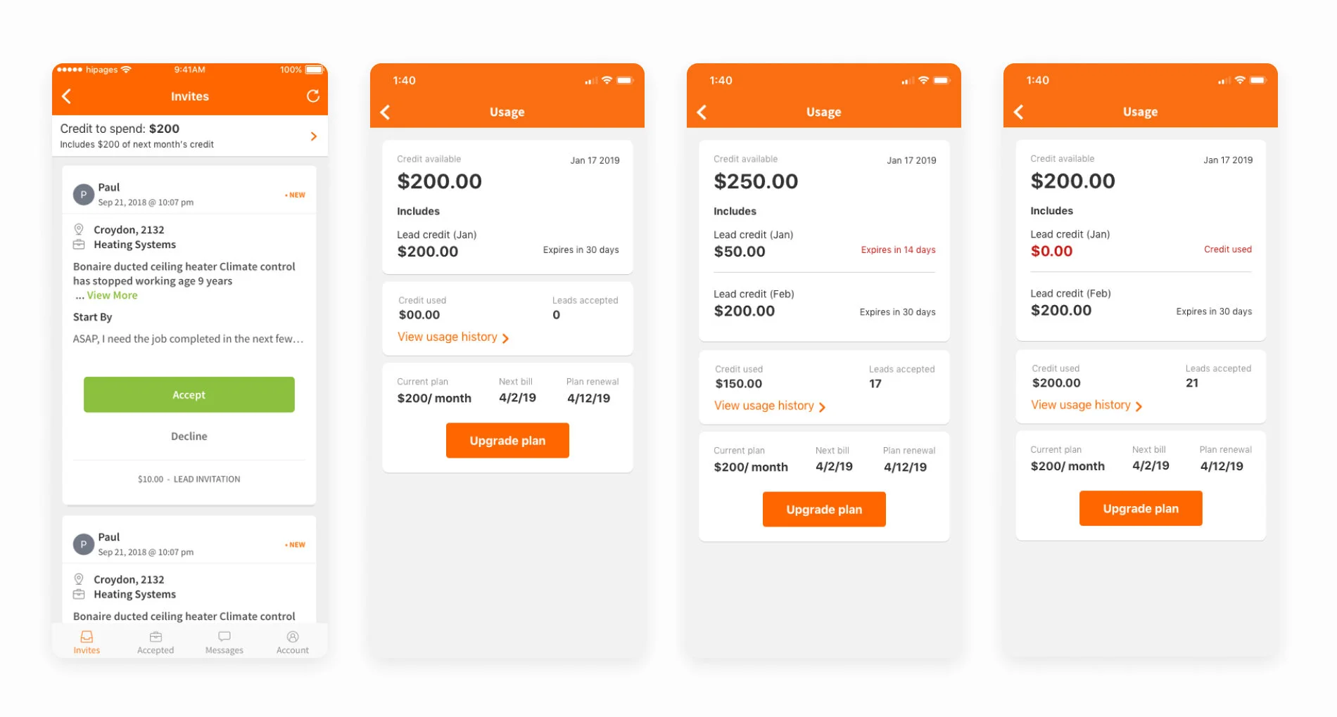
The company was planning to introduce a more flexible way of topping up credit by offering lead packs. With this new feature, users can have credit from multiple sources instead of a single lump sum which the current screen displays. I was looking to find an effective way to communicate this change to users.

A customer could spend one month’s credit and then begin to use next month’s plus purchase additional credit with lead packs.
Design
My approach with the new design was to have a clean aesthetic and only highlight tappable elements and a status banner that informed when something new was happening to their credit. The biggest challenge for me was trying to convey to tradespeople that their total credit could be made from smaller pools of credit that could expire independently.

The different types of credit pools
There were many variations and sketching sessions with all the stakeholders; some wanted to show all the details, while others wanted to streamline all the information displayed to reduce clutter. My job was to show the tradesperson only what they needed to see, for example, when they had some unused credit expiring.


Mapping out all the flows and edge cases of what can happen to a customer’s credit

Early design concepts, I slowly cut down and stripped out anything that wasn’t important making for a cleaner design.
Testing
We conducted multiple rounds of user testing where we wanted to find out which layout was easier to understand and what credit they had available.
The business rules of our monthly credit top-ups are confusing; tradespeople can dip into next month's credit if they use all of the current months. For example, I spent all of my September credit and then automatically started using October's credit.
Usability testing tasks:
Could a tradesperson tell us how their credit is broken down?
Did they understand why credit was expiring?
Did they know the different transactions on their usage history?
This prototype ran them through a few different scenarios - start of the month credit, unspent credit that was about to expire and finally spending into next month’s pool.
User testing insights:
There were lots of numbers on the screen, which made some of them feel confused.
Having the expiry dates was useful.
One user questioned why we showed what he was getting next month, which he had not yet paid for.
Most tradespeople said THEY would call sales to upgrade if they regularly saw the expiry alert or buy a lead pack.
However, this status didn't affect tradespeople who kept on top of their spending and budgeting.
Most tradespeople understood the credit expiring and why it was happening.
Some of the copy was small to read.
Synthesising all the insights and looking back through the critical pain points, it was clear that separating the content did not make it easier to understand and had the opposite effect. I wanted them to focus on one big number that told them what they had to spend, but flag when credit was about to expire. Looking at the layout again, I worked with my Product Manager to see what info we could move to another screen and create less noise.
Results
The final design shows a clean aesthetic that tested really well with tradies in the later stages, and they could easily navigate and comprehend all the numbers on the screen. But, more importantly, we communicated to them their spending habits which could influence their spending behaviour and budgeting in the future.
My work on the credit usage screen was just one small part of a much larger project, but it was an excellent challenge. Mapping out all the different scenarios and understanding all the complexities of our product (we have a lot of different rules!) but having a design that tested well with the customers and pleased all the stakeholders was rewarding.
Sales reps are finding it easier to converse with customers regarding their credit spending now that the tradesperson is more aware of their spending habits. Support team members also find it easier to chat with customers and guide them through a more user-friendly screen when they need help with credit.

