
Atlassian is a technology company that offers software solutions to help teams work more efficiently together. As part of the editor team, I was responsible for designing guidelines and maintaining the editor design system to guide other Atlassian teams.
My role:
UI design, maintaining Design systems, Interaction design, Prototyping.
Business goal:
Enable internal makers to build and ship features in the editor faster and more independently.
Results:
Designed new editor components and guidelines in Figma adopted by 48 teams
Unblocked 7 projects working with the editor
10,252 Figma components inserted by various teams in 30 days
Lessons learned:
01
Find yourself a good content designer.
I leaned on my content designer to help when revising the guidelines that took the form of a Confluence page. They asked the right questions and picked apart what I had written to make it super easy to read and consume.
02
It can be slow to interview people in your own company.
Everyone has busy schedules so it was hard to interview enough Makers to get some meaningful data at the start of this project. Ideally, next time I might send out a survey or get them to send feedback async as it would take less time than scheduling interviews.
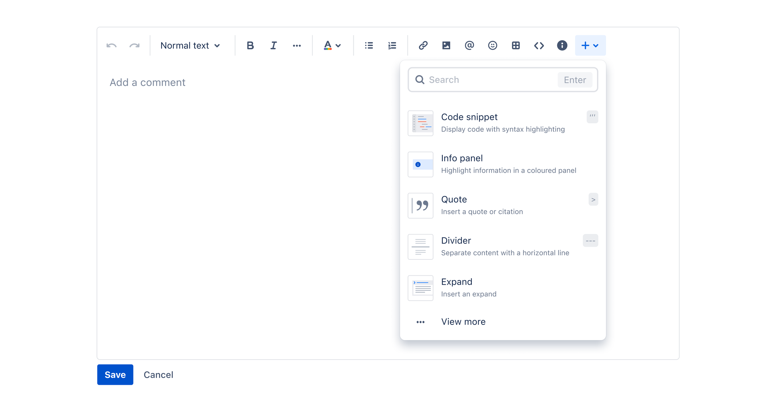
An example of the editor in action.
Research
The goal of this work was to enable internal makers to build and ship features in the Editor faster and more independently, in a way that is scalable and sustainable.
Working in a platform team means that several other teams want to use your tech and designs to build their features. We were finding that our team was slowing projects down due to not having clear guidelines and processes for adopting editor components. With the editor powering products such as Confluence, Jira and Trello, many teams across the company wanted to release new features or run experiments while in edit mode. What we were finding was that with no clear guidance on where to place new buttons or UI teams were placing it wherever they wanted or designing their own custom components. As a result, our toolbar was becoming overcrowded and teams were running into each other.

Teams wanted to add in new features that overcrowded the toolbar
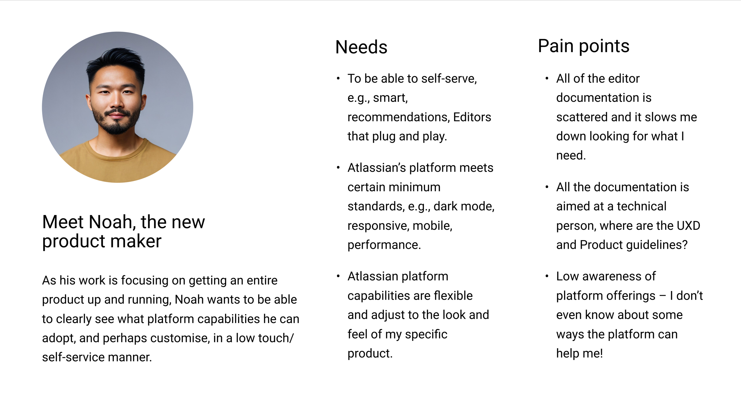
After running a survey and interviewing other teams it was clear that working with the editor for the first time was daunting. We coined the term Makers for anyone looking to build or design a feature using a platform capability. In the interviews Makers often brought up the same goals, pains and needs so I was able to craft a persona that would help the wider team understand the problems we were solving and most importantly the reasons behind these pain points.
Having access to data on the most highly used editor tools I knew the areas that were no-go zones for modification and experiments so I could easily communicate this with other teams, however, this only solved part of the problem as I needed a scalable way to ensure anything new being designed was following consistent designs with the rest of the editor.
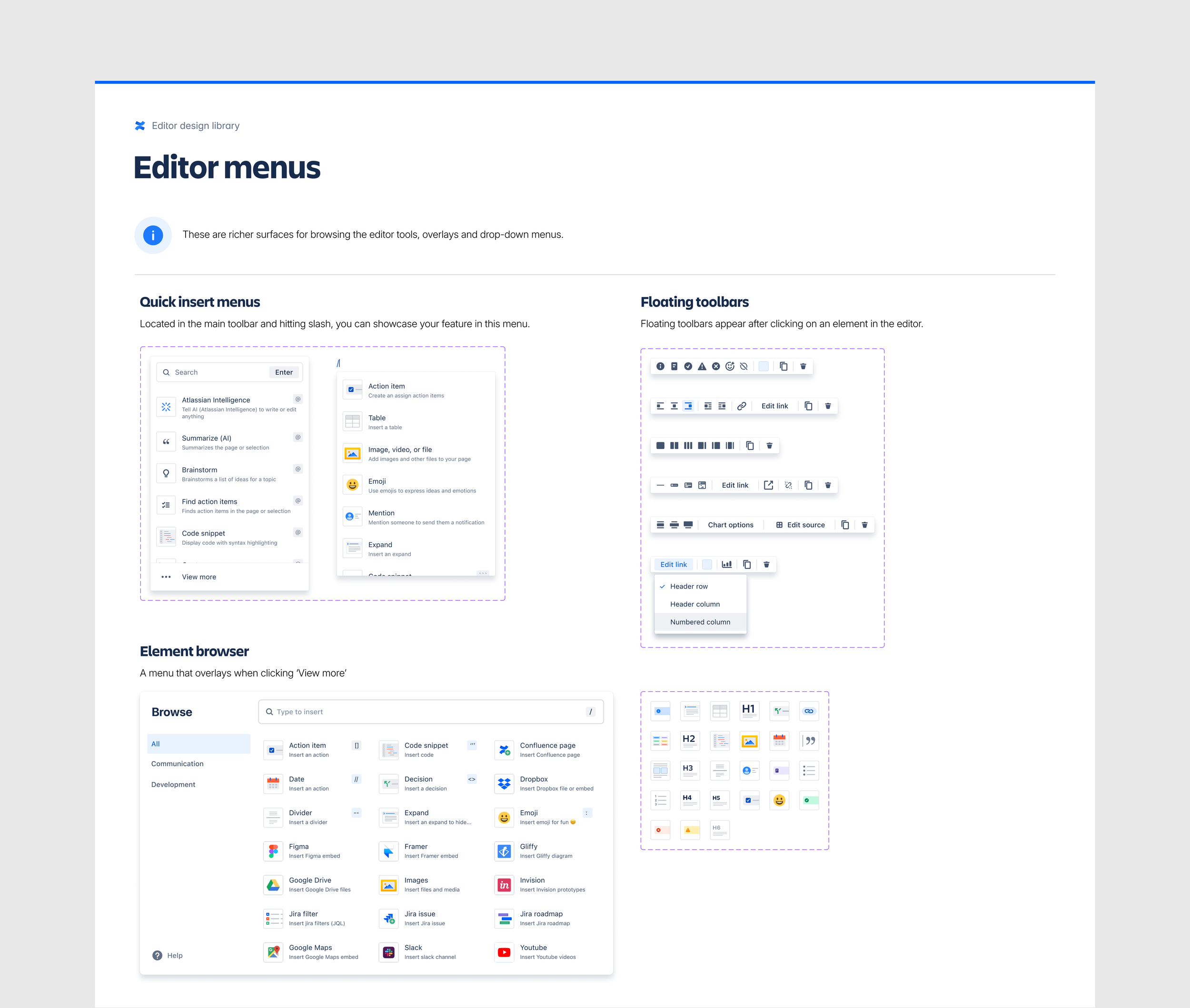
I believe if we had a clear Figma library with updated components ready for use it would it would help teams ship features faster. Teams needed a path forward so that the toolbar could scale for future features.
Design
I started with taking an audit of the available editor types and UI surfaces that we had available for customisation. Step one was about making Makers aware of the options they had.
I wanted to start with the big picture thinking and slowly work my way down to the details, compiling a list of the different types of editors we had. For example, Confluence uses what we call a full-page editor because a user will spend more time crafting content as opposed to what we call the standard editor in Jira which has fewer tools. After all, users spend less time crafting content. I wanted to help Makers decide on where they were going to place their new feature.
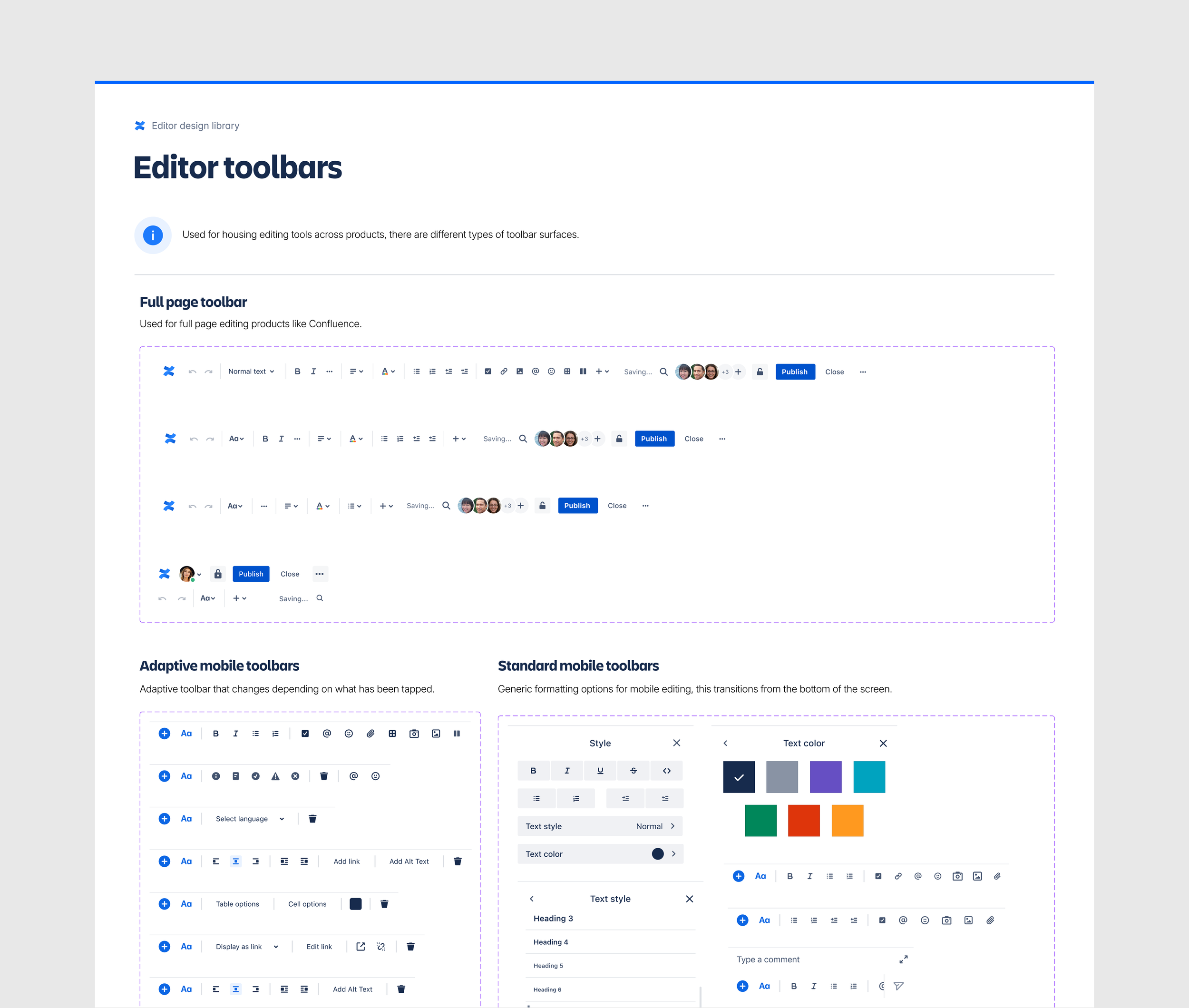
Full page editor toolbar - this was the editor type most teams wanted to build in.
The standard editor toolbar and the mobile toolbar.
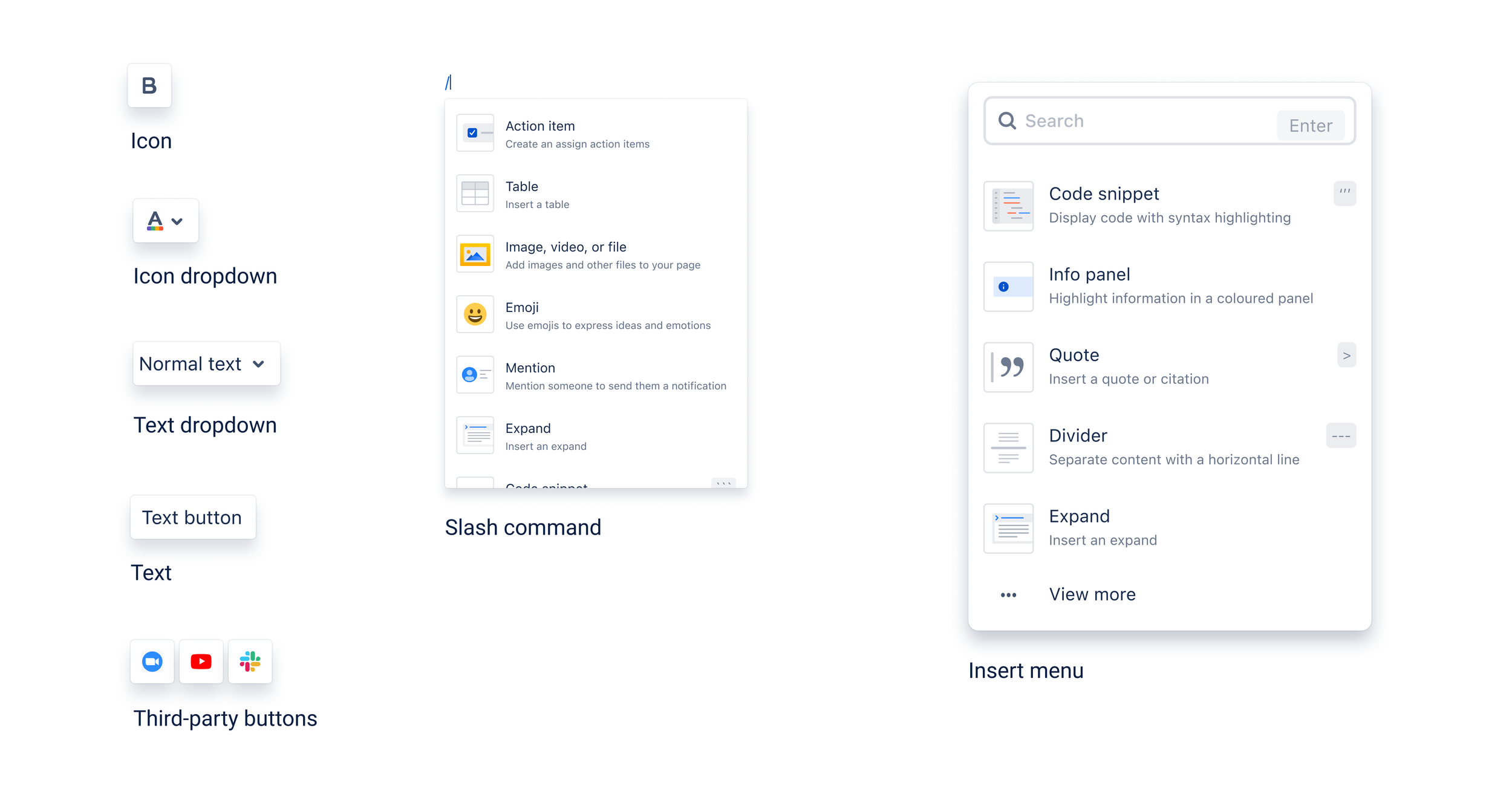
Different button and menus that teams can use to ship features
Teams thought the editor team owned all toolbar components, but only part was maintained by them. I wanted to break down the toolbar into easy-to-understand groups of what areas teams could ship new features in.
Breakdown of tools in the toolbar so teams know what they can customise
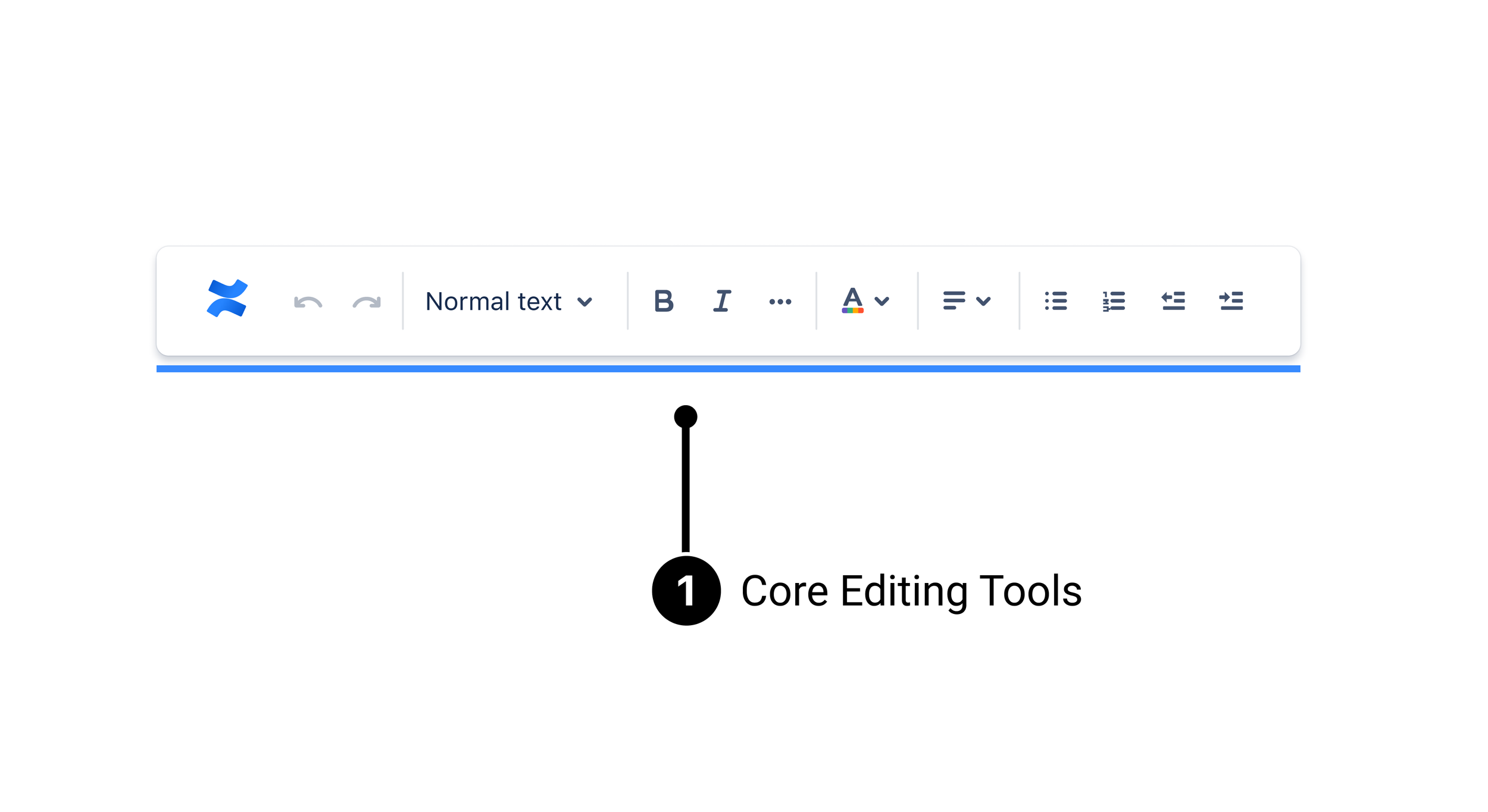
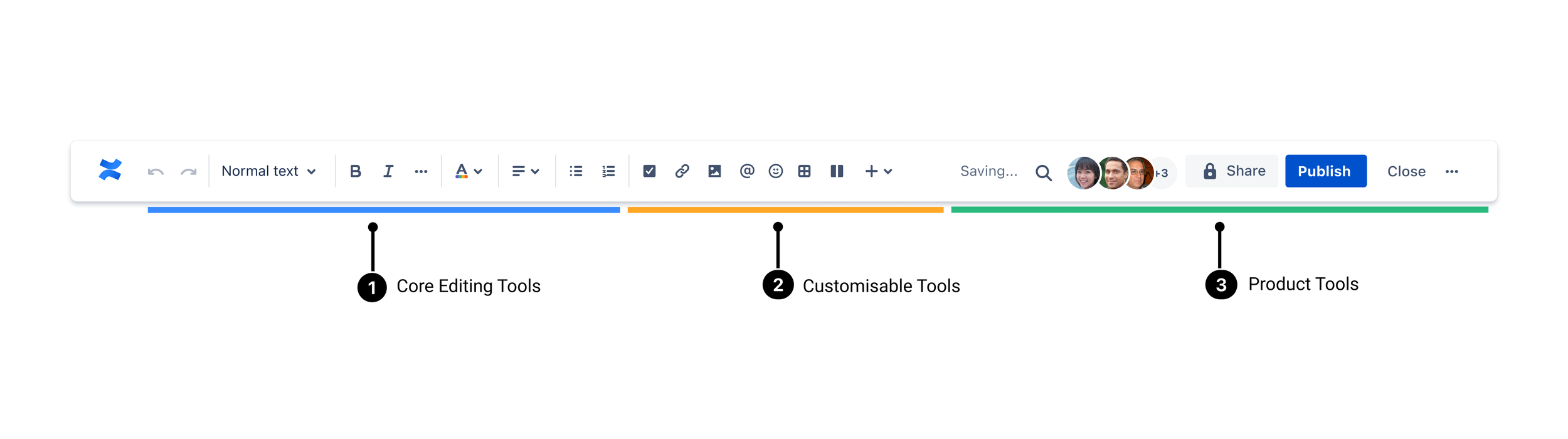
Core editing tools
These are editing tools that are consistent across most editing products and will be mandatory for all toolbars. Examples include Text formatting, Bold, Italic, Undo/Redo and Lists. I wanted this group to be owned by the editor platform team and a no-go zone for any other team, I didn’t want these highly used tools to be inconsistent between products.
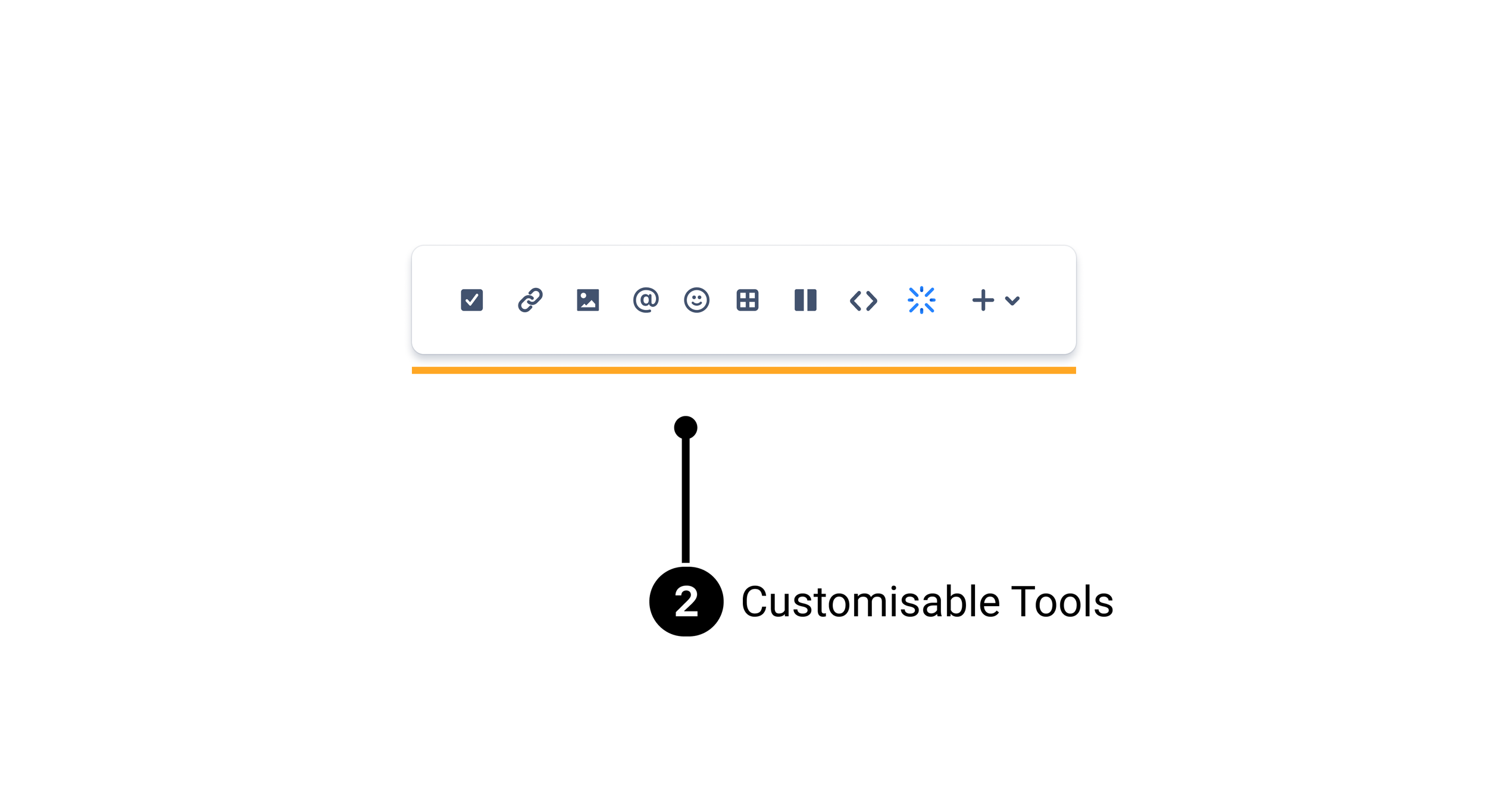
Customisable tools
These are tools that insert different types of content blocks. These are not related to font/style or other generic formatting. Teams could customise these tools depending on what the product was. For example, leaving a comment in Jira might want to include the emoji button.
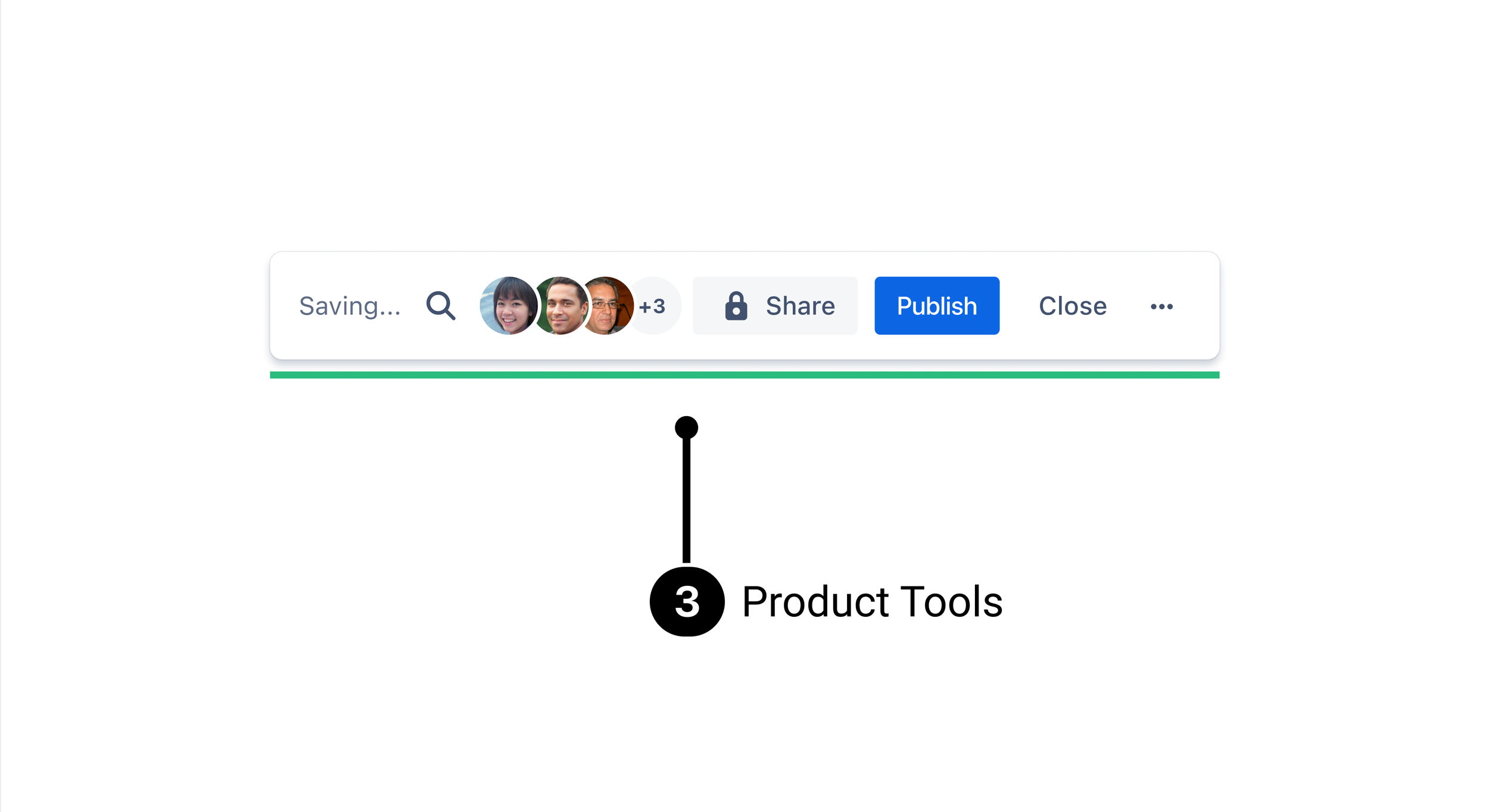
Product tools
These are tools that insert different types of content blocks. These are not related to font/style or other generic formatting. Teams could customise these tools depending on what the product was. For example, leaving a comment in Jira might want to include the emoji button.
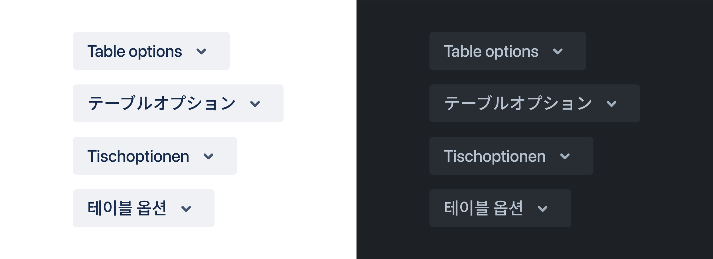
Editors should be accessible to everyone. With that in mind, designers could overlook not accounting for accessibility and internationalisation when adding a new button or menu.
I wanted to set a standard and ensure that before anything new in the editor was shipped it had a tooltip and alt text that would help screenreaders and be keyboard accessible by tabbing. Buttons had to meet colour contrast WCAG 2.0 requirements and be large enough to tap if they were designed for mobile. Finally, I wanted to ensure they had tested out how long a word could be in other languages as sometimes it would squish designs, for example, the German language often translates into long words. If all these requirements were met we could get the designs into build.
Testing in dark mode and in a few languages was mandatory for new features
Results
Post-release there have been 7 projects where the designer and engineers have referenced the Figma library and guidelines.
Releasing toolbar guidelines and an updated Figma library that was widely adopted by other teams helped unblock projects and ship features faster. Before joining the editor team the toolbar was lacking any organisational structure and teams were getting blocked and looking for guidance.
This helped the teams wanting to work with the editor team make decisions faster and also took the load of my team who had our roadmap of features to ship.
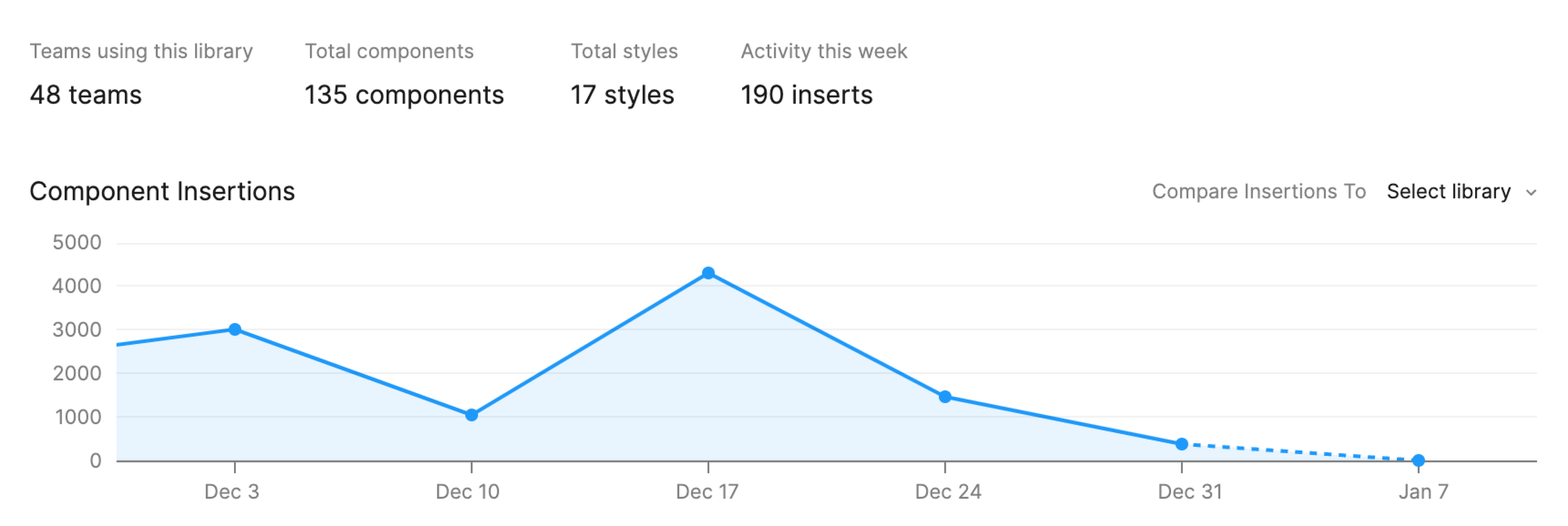
First 30 days after publishing the Editor Design System Figma file
Screenshot of the Figma library
Screenshot of the Figma library