
Background
Bringing digital whiteboards into Confluence gives our users a new surface to brainstorm ideas and visualise workflows. I co-designed the core features and new integration capabilities that allowed whiteboards to work easily across Confluence and the other Atlassian products.
My role
Strategy planning, User research, User flows, UX design and Prototyping.
Results
Launch a Beta version of Confluence whiteboards.
Increased MAU of whiteboards from EAP to Beta launch.
Increased adoption of non-tech teams using Confluence.
WAU increased by 60% when launching full version.
SEQ Usability testing scores of 6.0+ out of 7.0 across all key tasks.
Key responsibilities:
Working within a cross-functional team to prioritise what features to work on.
Designing and shipping text and sticky note resizing.
Supporting the design and shipping of the whiteboard timer.
Working on integrating whiteboards with the existing Confluence experience.
Conducting usability testing with users to ensure the features we shipped were high quality.
The onboarding flow for new customers using whiteboards.
Research
Customers who were in the early access program of whiteboards were calling for core features that we had put off till now.
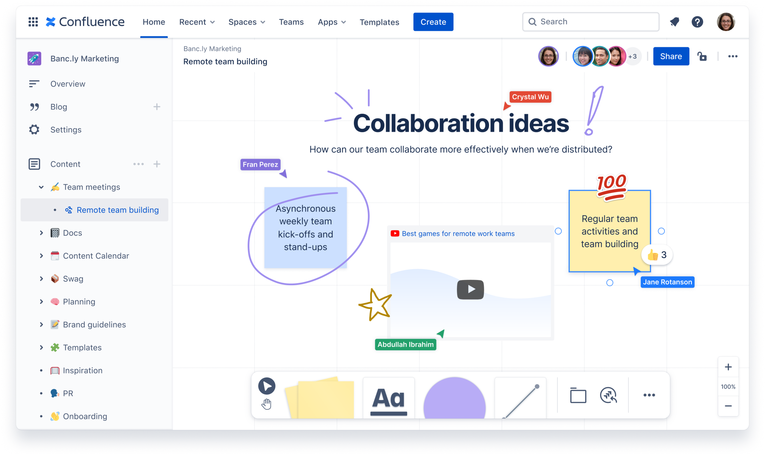
Our primary customer use cases are brainstorming, planning sessions, and mapping out diagrams. We regularly got feedback both internally from other Atlassians and our early access customers. This process was great input for where we needed to focus our efforts. For example, we heard that users were getting blocked on some of their tasks by a few key missing features, such as resizing text and sticky notes, having access to more templates, having a timer inside the whiteboard, and a way to count voting.
“The minimum size you can make a shape isn’t small enough, and it doesn’t seem like sticky notes can be resized.”
“Would love to be able to resize post-it notes :)”
“Also, we could potentially consider resizing text outside of the heading 1/2/3 options like a drag to resize option as well!”
Running discovery sessions in the lead-up to Beta
When I joined the team, whiteboards were already in an early access program, and we already had a small subset of customers using the product. When our whiteboard was preparing to launch to Beta, I was tasked with designing the onboarding and migration flows for customers. I ran some discovery interviews with customers to get an idea of what their expectations were for whiteboards being inside Confluence.

Results from interviews:
Being able to copy and move whiteboards
Locking down whiteboards to be private
Drag and drop the whiteboard inside the page tree
Improve core whiteboard capabilities to increase adoption for new and existing customers
Design
Leveraging what I learned from the research gathered provided more clarity around the expected capabilities users wanted for Confluence whiteboards. Amongst the design team, we each had an area to design and ensure it got into Beta. The projects I was driving the design for were text and sticky note resizing, timer, and onboarding existing and new customers into Beta.
Text and sticky note resizing
We had to technically limit some of the text resizing abilities due to using our platform editor, which does not include point resizing. We needed a way to allow users to create consistently resized elements if they wished. E.g., If a user wanted to have the same size large headings. Below you can see some explorations on how the headings dropdown menu would work.

The visual designs for resizing were all about keeping things familiar, showing handles on the corners at which anything could be resized. When a user hovered over a draggable area, their cursor would change to show the direction it was being resized.
Onboarding
I was tasked with mapping out the onboarding flow for both new users and existing whiteboards. Both flows had slightly different nuances with existing users; it was a matter of showing them the new features introduced to Beta with the Confluence integrations. While brand-new users who signed up for whiteboards required some onboarding focusing on the basic tools and features.

There were many flows sketched out with my Product Manager's help to figure out all the edge cases and the happy path for users—many iterations and chopping and changing.
One challenge we faced was that there needed to be more resources and patterns to design the flows. This required the engineering team and me to design custom spotlights and modals to highlight key aspects of the product. We opted to provide a familiar experience to other whiteboard products by using the same type of iconography and interaction behavior. This meant that our users could get up and going quickly with our product.


Integrating with Confluence
As mentioned earlier, one of the challenges was letting existing users know, "Hey, whiteboards now behave just like a Confluence page," meaning you could create and organise your boards in the content tree. This was a massive plus for us as we were hearing customers wanting to organise their boards along with content for their projects and documents. They no longer needed to sketch out something in one product and then manually transfer things over to Confluence.

Users were now able to create from the content tree.
One big pain point we were solving with Beta was allowing users to have restriction settings and lockdown boards if necessary. Users often like to start their messy work privately before sharing.

Testing
Before we launched, I conducted a usability session with participants who were existing Confluence users but had never used a whiteboard before. I wanted to see if they understood how whiteboards worked within Confluence and all the capabilities you could do, as well as basic whiteboard tasks like using sticky notes.
The results were that new users didn't need to be reminded of Confluence features like creating in the page tree or restricting a board, as this was just expected. What we learned was that it's better to trim down the onboarding to focus more on the whiteboard-specific features and differentiators we had. For example, converting sticky notes into Jira Issues that make planning projects easier is what we wanted to focus on for onboarding.

We asked participants to recreate diagrams we gave them during the session
Results
After six months of work with all the teams involved, we integrated whiteboards from a single product feature into Confluence and launched Beta. We saw 35k customer turn on whiteboards for their teams.
The impact I made involved ensuring we had a lean onboarding flow for new and existing customers, designing how restrictions worked on a whiteboard with all the different view modes and edge cases, text resizing elements, and finally, letting you set a timer on the whiteboard. We ran more usability testing with all these new features and achieved an SEQ (Single-Ease-Question) score of 6.4 out of 7. This involved getting users to complete tasks on whiteboards and asking them how easy or difficult it is to use.

Whiteboards are now easy to create in Confluence.

When creating a whiteboard there a many template options to get you started.

Final timer design in action.

One of the spotlights for onboarding - this one was showing how to use sections.

The onboarding spotlight animations I made using Figma.